Designing a Dead-Letter Queue for Webhooks
A webhook sends an event from one service to another over HTTP. If the receiver cannot handle an event, the sender may…
Framer is a website builder that works like a design tool. You place and style everything on a canvas, and Framer hosts the finished site. If you are thinking about it for your business website, you probably want to know how hard it is to use, what it costs and what can go wrong.
To find out, I built a complete website for a made-up bakery on the free plan. I started from a free template, changed the text, photos and colors and fixed the layout for phones. I added a news section and a contact form, published the site and tested it on a computer and a phone. I also gave Framer's AI agent a short description of a physiotherapy practice and let it build a second site.
The bakery site looks professional, and changing text and photos was easy. Most problems only showed up after publishing. Old links from the template, the phone menu and the form emails all needed fixing. The AI agent built four pages in about three and a half minutes, but its first version stacked the menu links on top of each other.
Framer suits you if you want a site that looks designed, with a handful of pages, some news posts and a contact form. You also need to be willing to learn an editor with layers, screen sizes and reusable parts.
Look elsewhere if you want to sell products on the site, publish hundreds of articles, or prefer an editor where you only fill in text and photos.
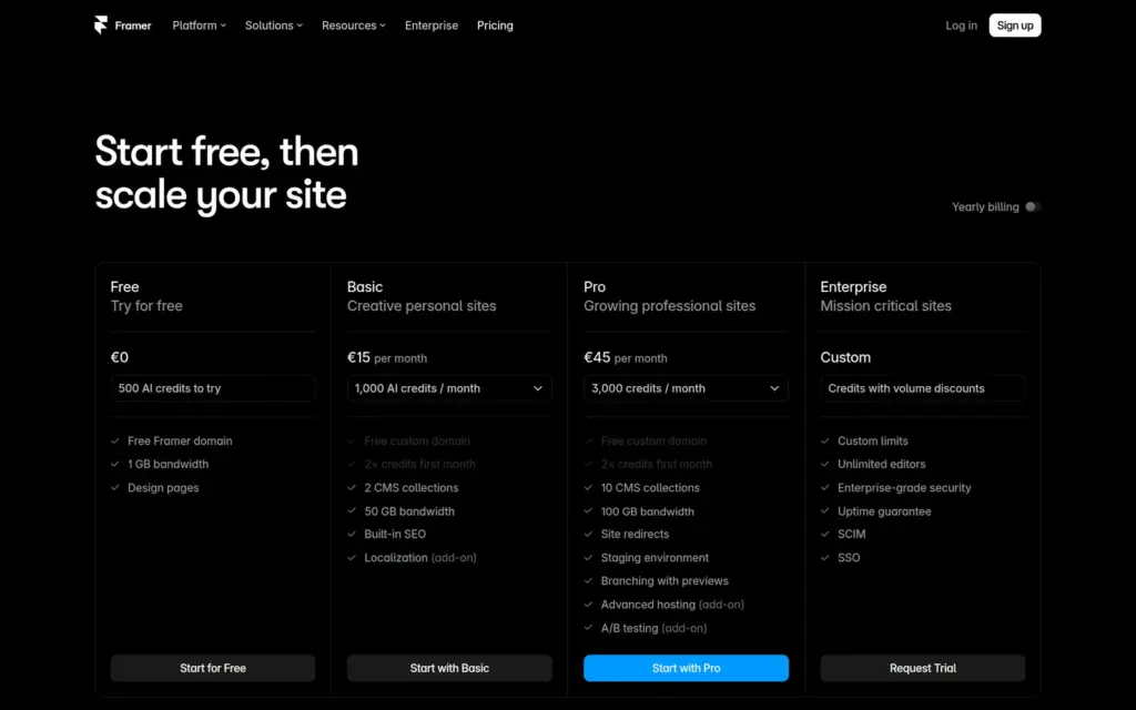
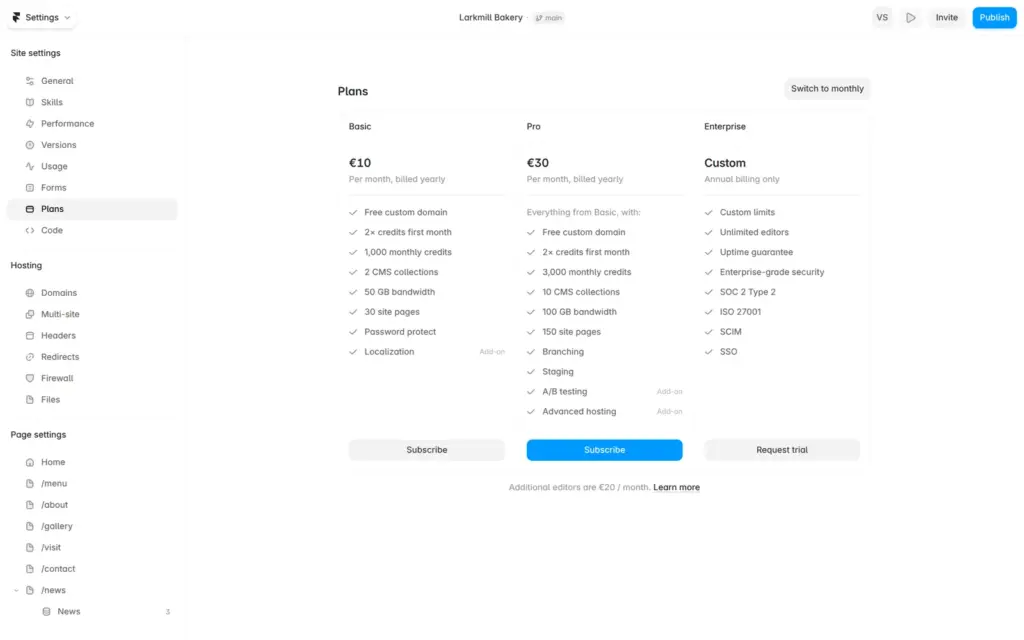
Price: you can build and publish a site for free on a framer.website address. Your own domain needs a paid plan. Basic costs $10 or €10 a month on yearly billing and $15 or €15 on monthly billing. Pro costs $30 or €30 a month on yearly billing and $45 or €45 on monthly billing. Prices are per site.
Tested: in October 2026 on the free plan. Prices checked on October 6, 2026.
Not tested: paid features, a custom domain and Framer's support. Framer did not pay for this review, and there are no affiliate links.
What I liked:
What bothered me:
Larkmill Bakery is a made-up neighborhood bakery, and its footer says so. It has the template's six pages for home, menu, about, gallery, visit and contact. I added a news section with three posts and a contact form for cake orders.
The design comes from Morrow & Grain, a free template by Ken Huang. I replaced the text, swapped some photos, changed the colors to green and added the news section and the form. The new photos come from Unsplash, through a plugin inside Framer. The other photos came with the template.
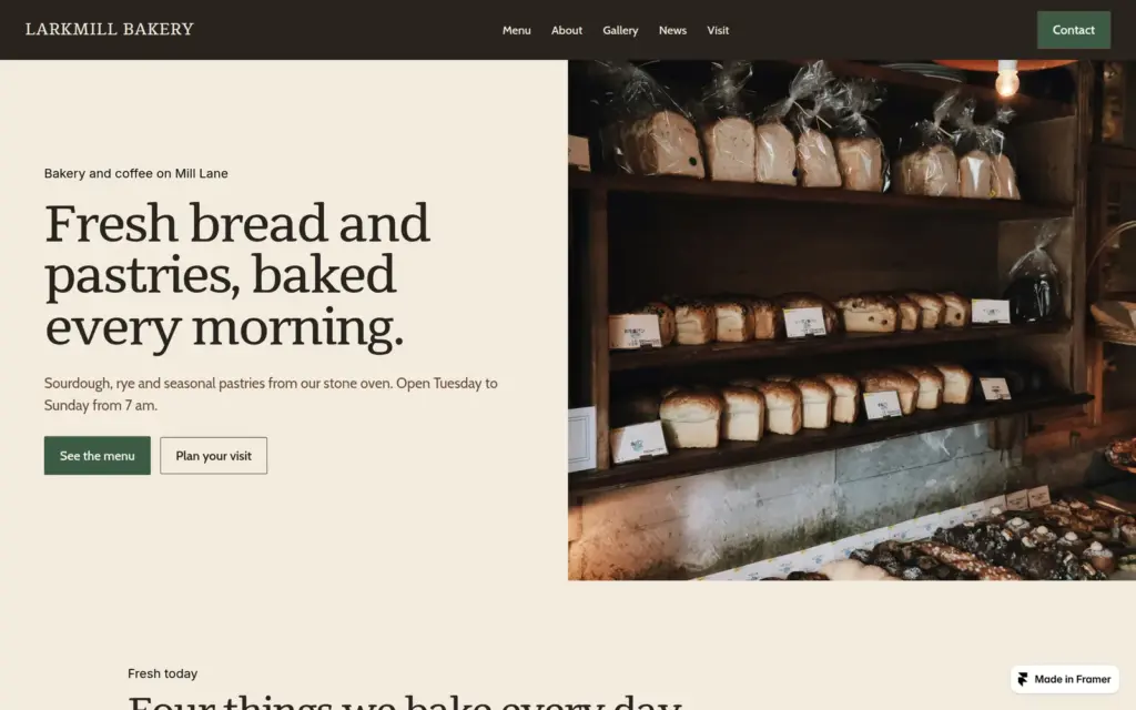
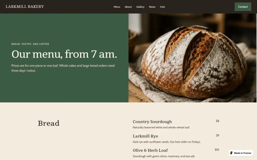
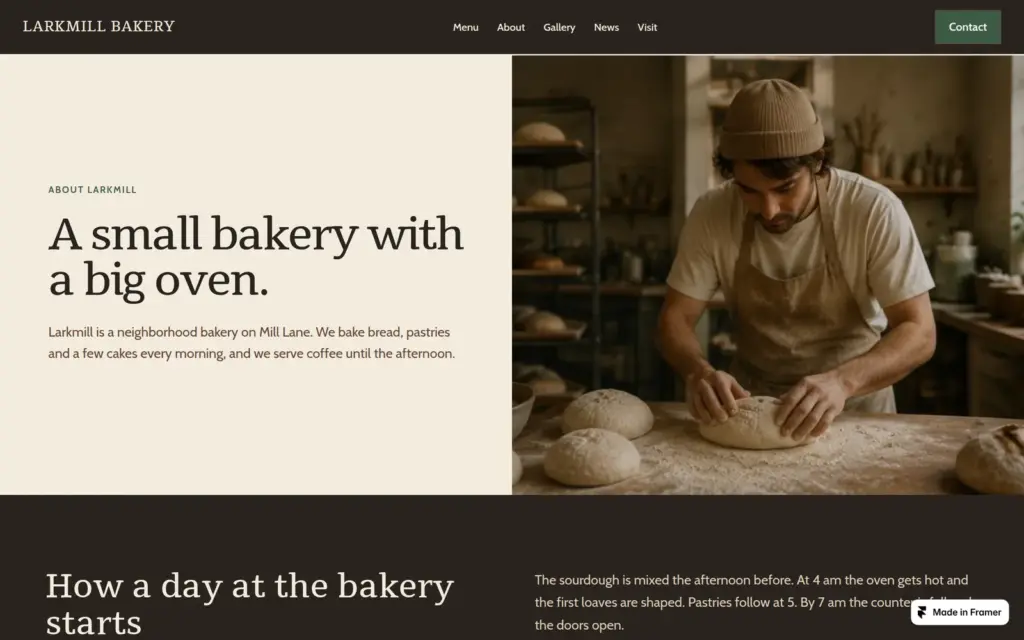
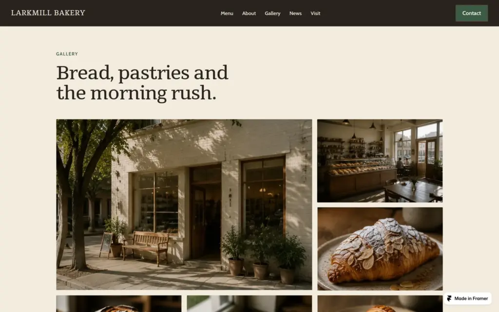
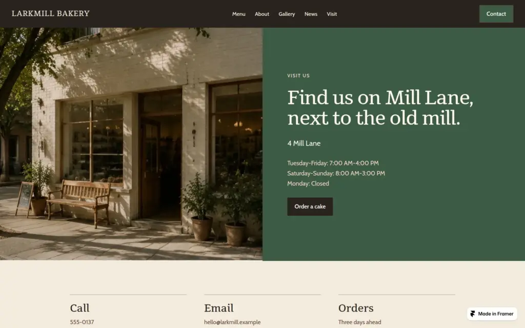
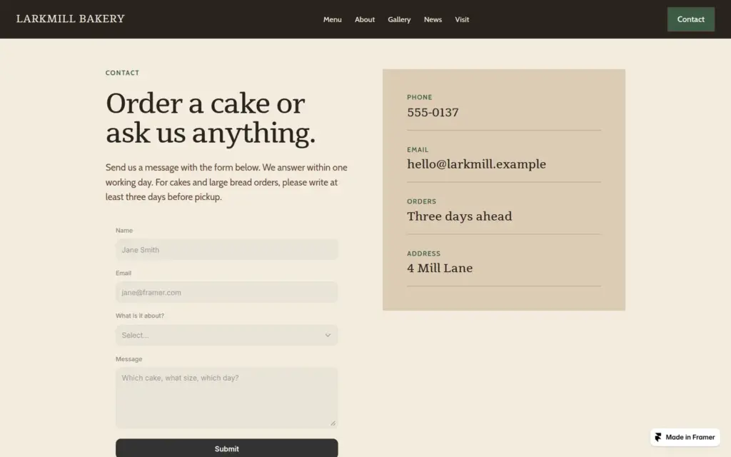
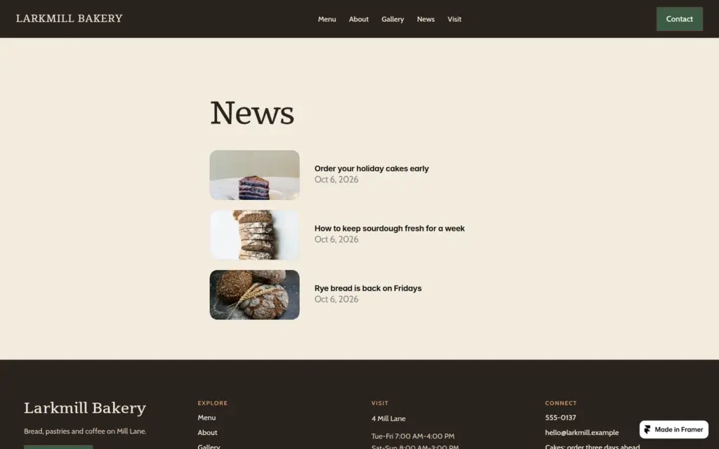
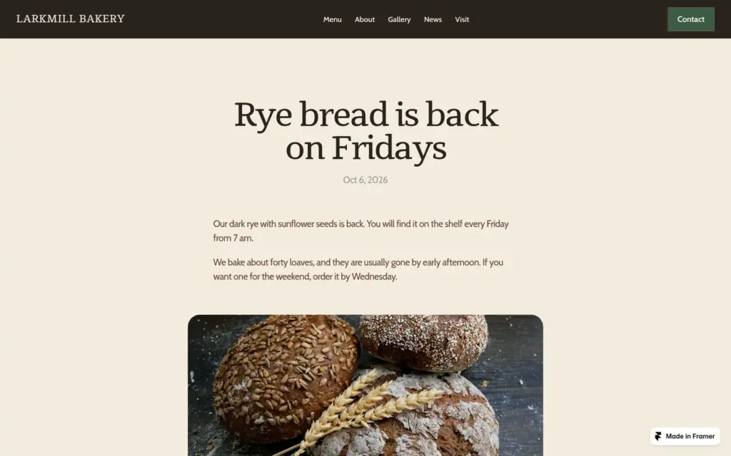
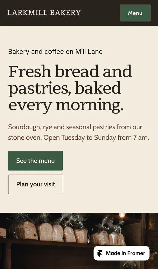
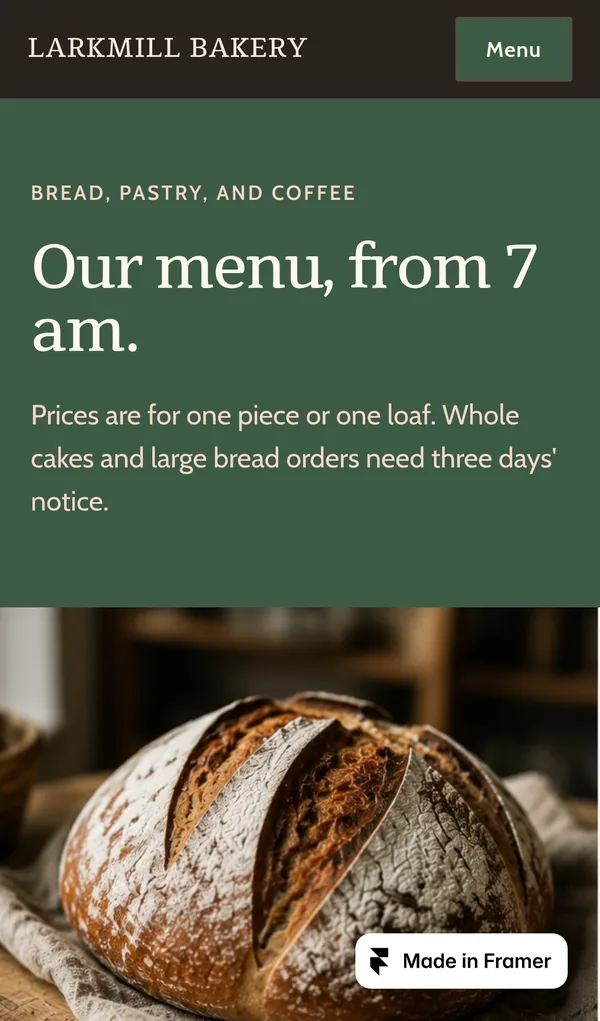
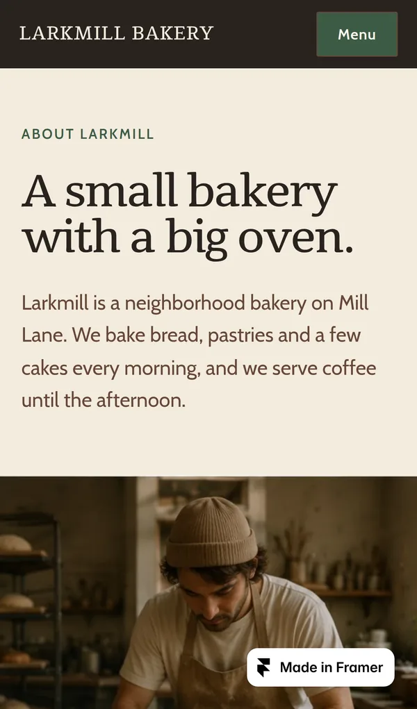
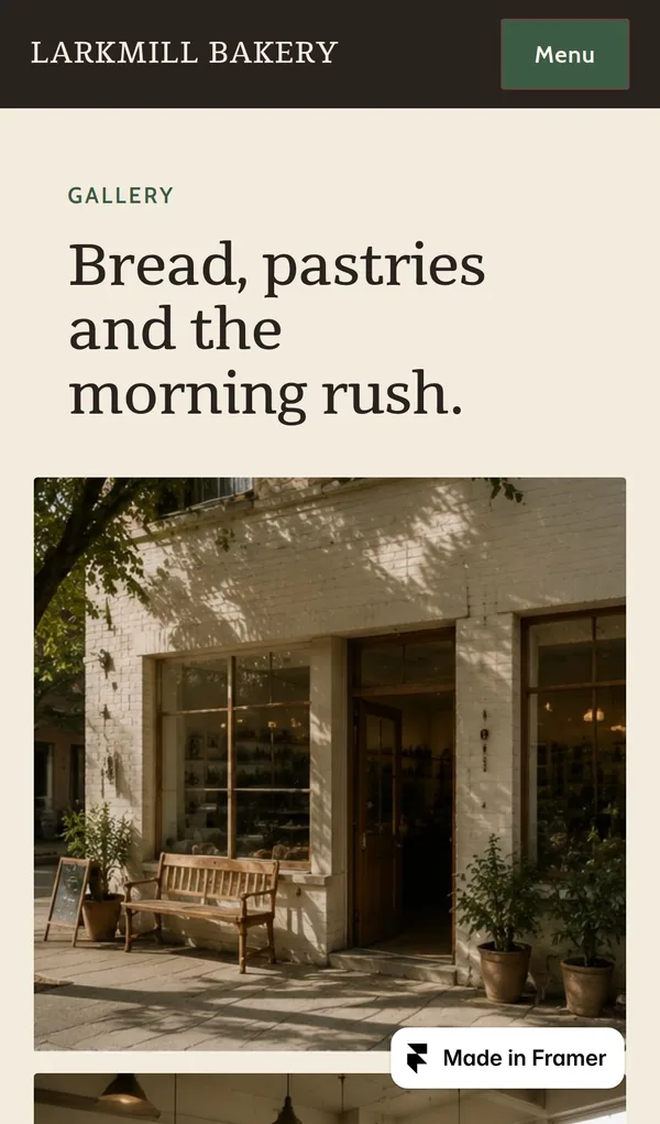
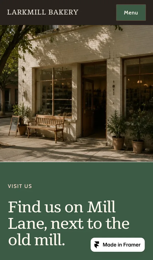
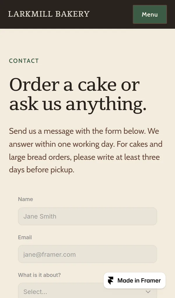
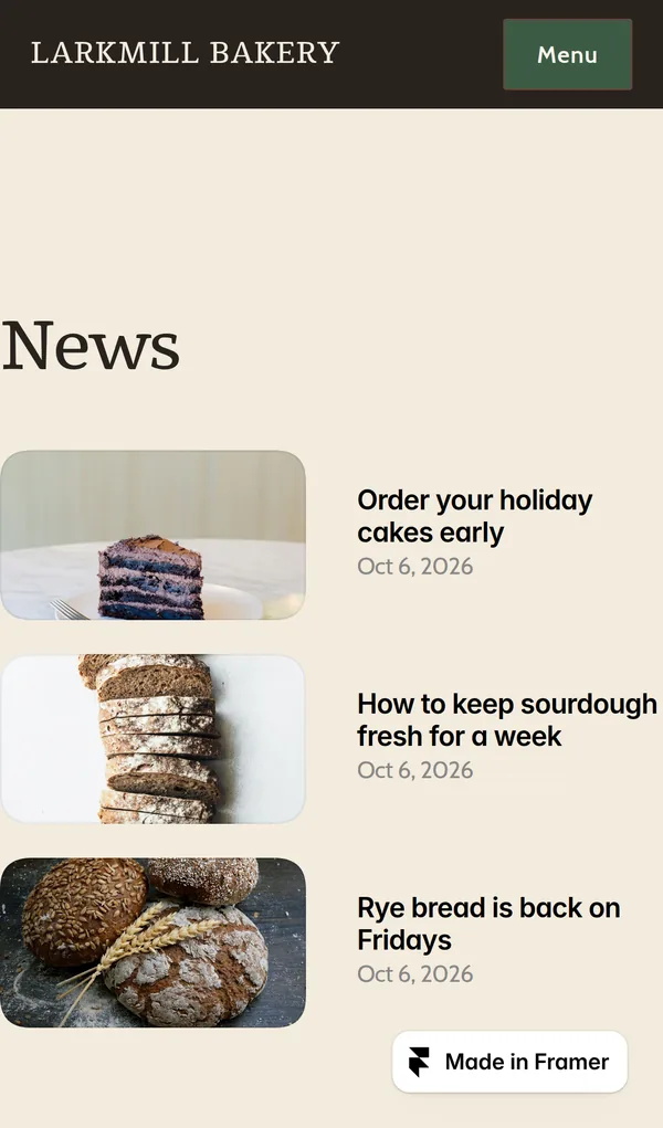
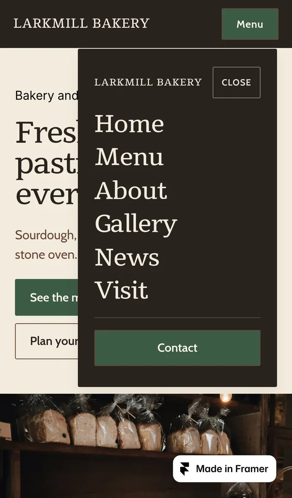
Open the bakery site. It is a demo, so please do not send personal information through its form.
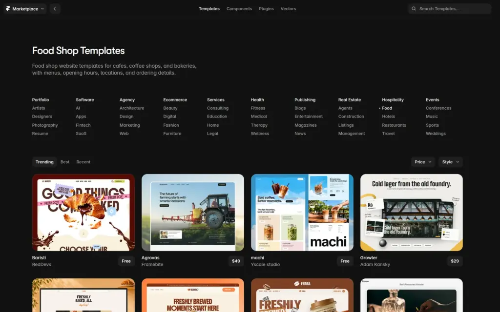
Framer's marketplace has templates for most kinds of business. The food category alone has dozens. Many are free, and the paid ones I saw cost between $23 and $119. I compared eight free bakery and café templates and picked Morrow & Grain for its warm colors, large photos and six finished pages.
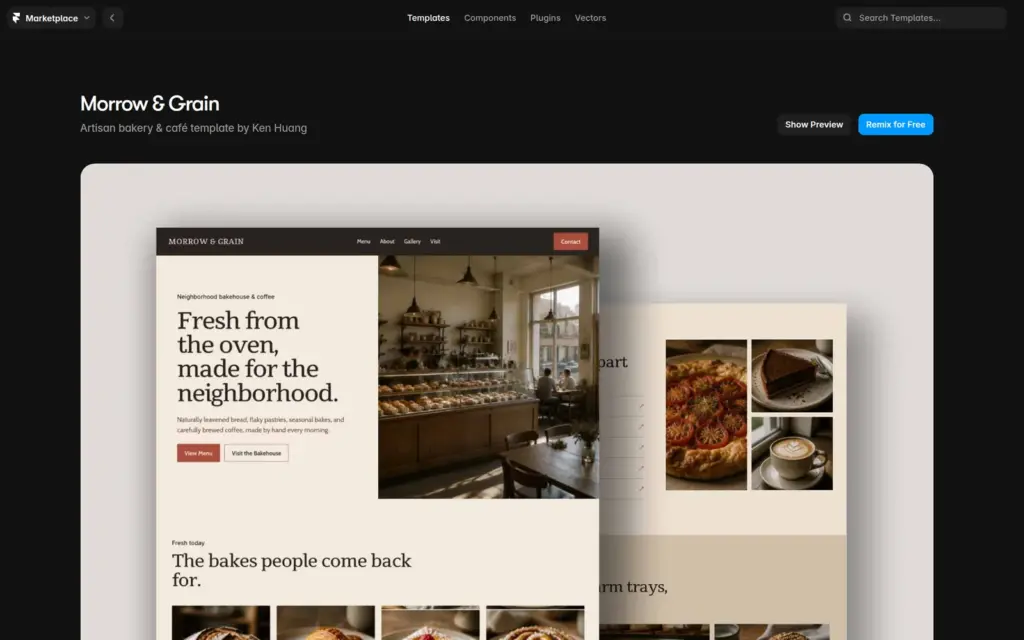
"Remix for Free" copies the template into your account and opens it in the editor. It comes with text styles, color styles and a shared header and footer. Its text and photos belong to a made-up bakery called Morrow & Grain.
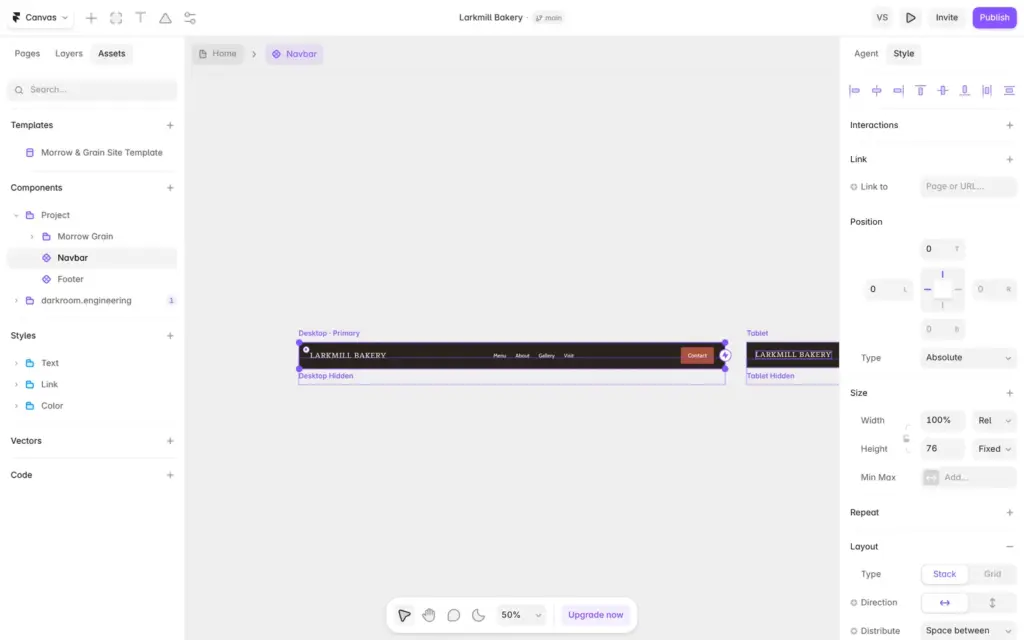
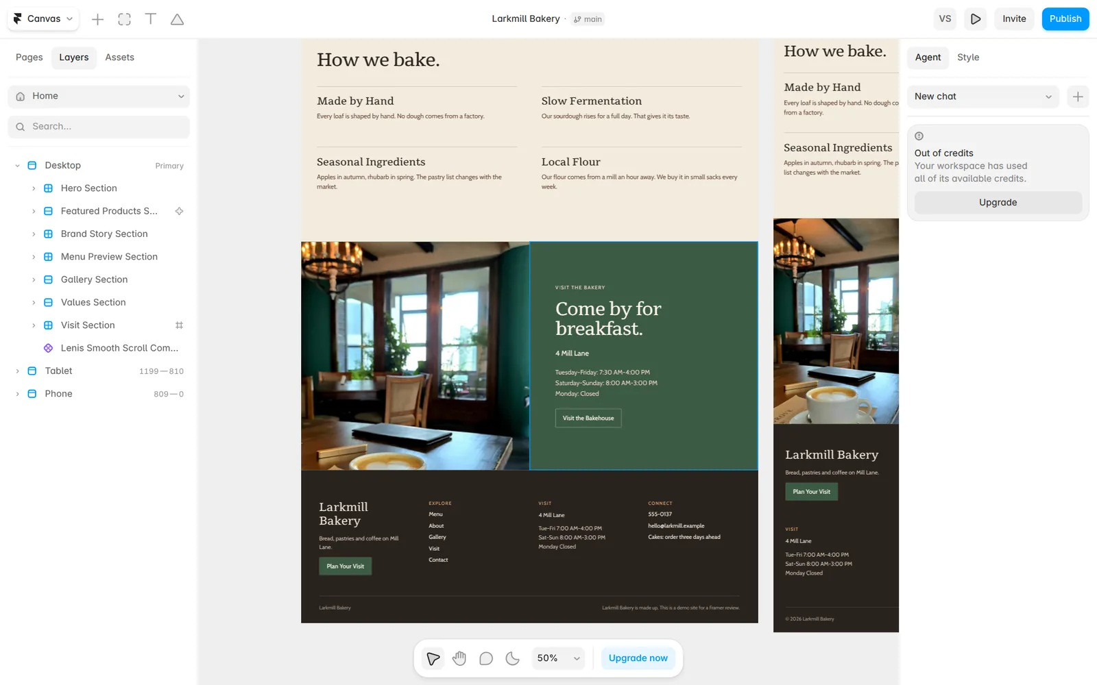
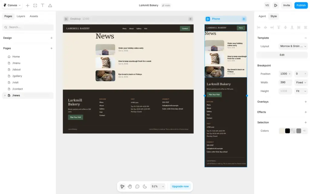
The editor shows each page three times, for desktop, tablet and phone. Pages are listed on the left. The panel on the right shows the settings of whatever you select, and it also holds the AI agent.
The header and footer are shared components. A component is a part you design once and use on many pages. I opened the header, typed the new name, and all pages showed it at all three screen sizes.
To change text on a page, you double-click it and type. Buttons work differently. They are components too, so their text is a setting in the right panel.
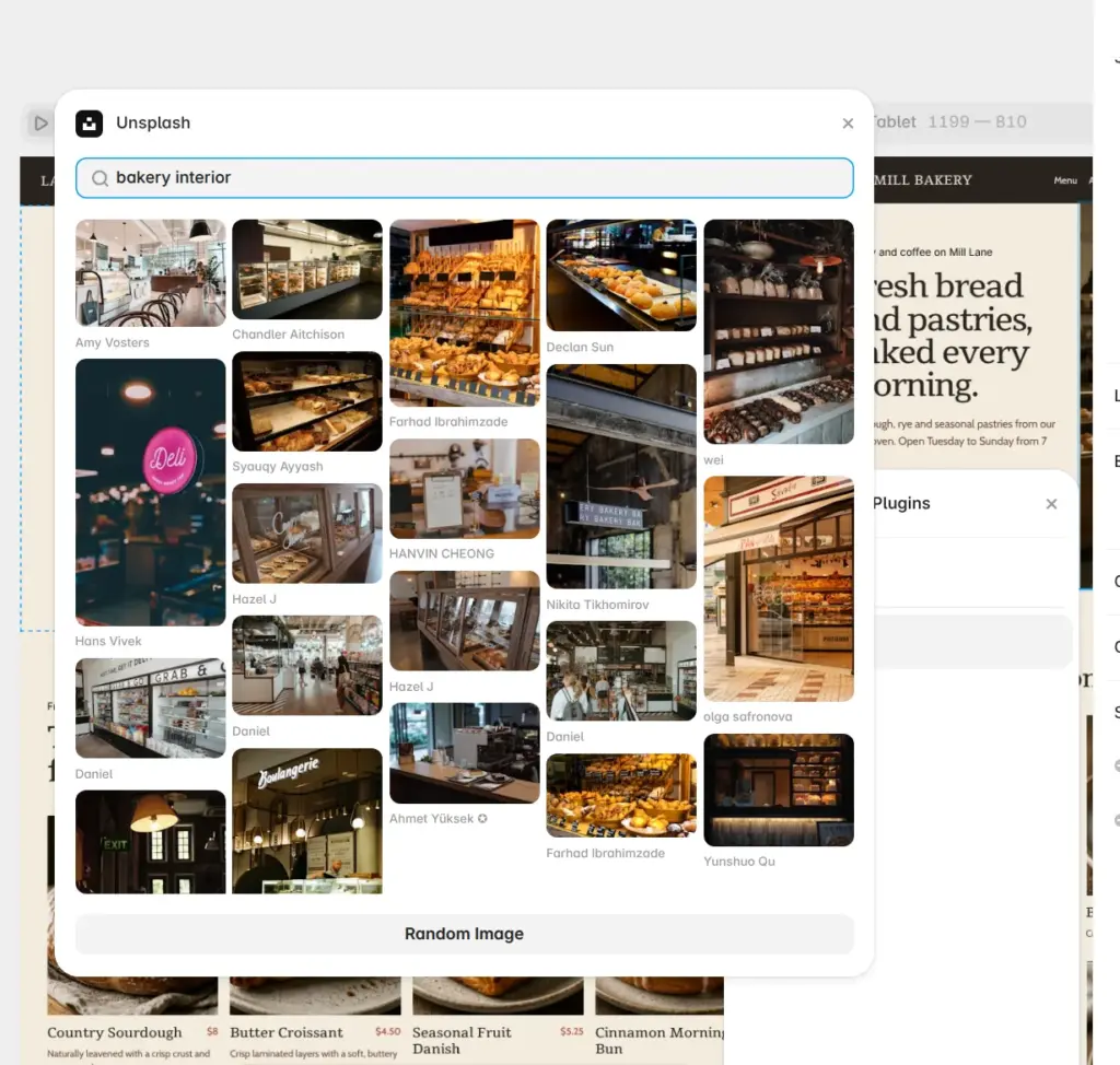
For photos, Framer has an Unsplash plugin. You select an image, open its settings and search Unsplash's free photo library without leaving the editor. I picked photos without shop signs or logos on them.
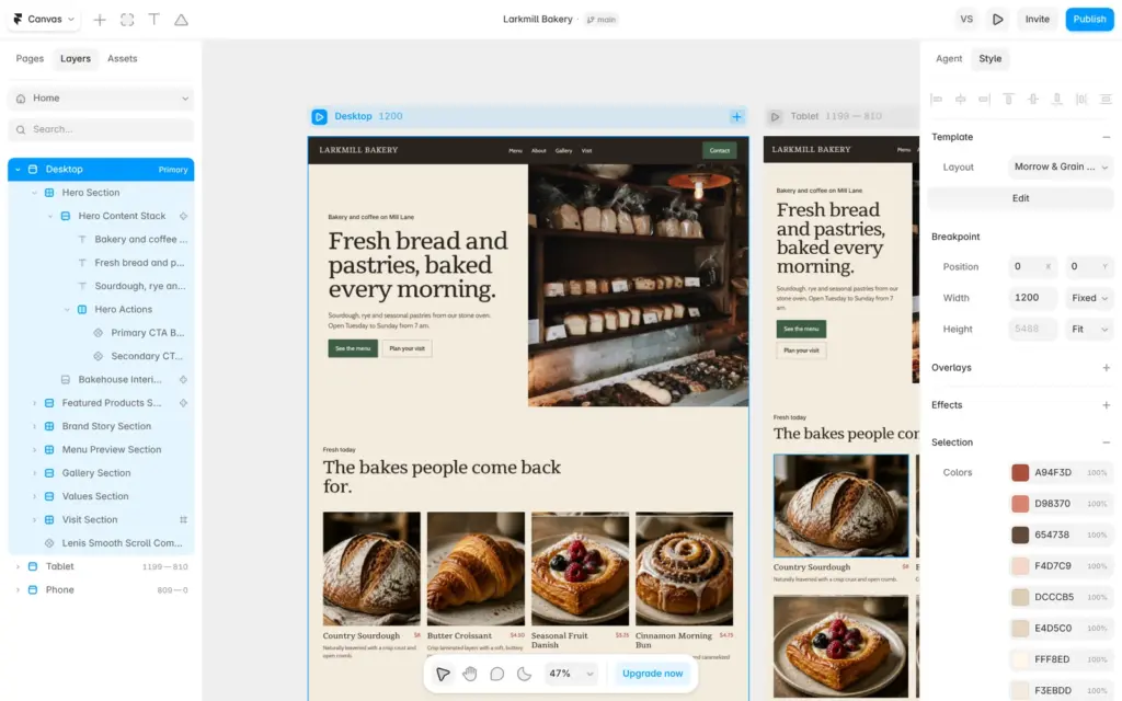
The template saves its colors as color styles called cream, black, red and bright red. I changed red to a dark green, and the buttons with that style turned green on all pages.
Some parts did not change. A box on the home page, the prices and some arrows had the old red typed in directly. To find them, I selected a whole page. The right panel then lists all colors on that page, and I switched the old red to my green style there.
I had to do this for each page and each screen size, and again inside the header and footer. I found no button that replaces a color everywhere.
Framer gives each page a separate phone version. Desktop is 1,200 pixels wide in the editor, tablet covers 810 to 1,199 pixels and phone covers anything narrower.
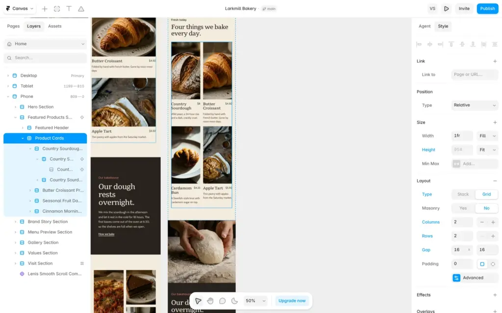
On the phone, the four products on the home page sat in one long column. I selected the product cards in the phone version, switched them from a stack to a grid with two columns, removed two empty grid rows and made the gap smaller. Desktop and tablet kept their layouts.
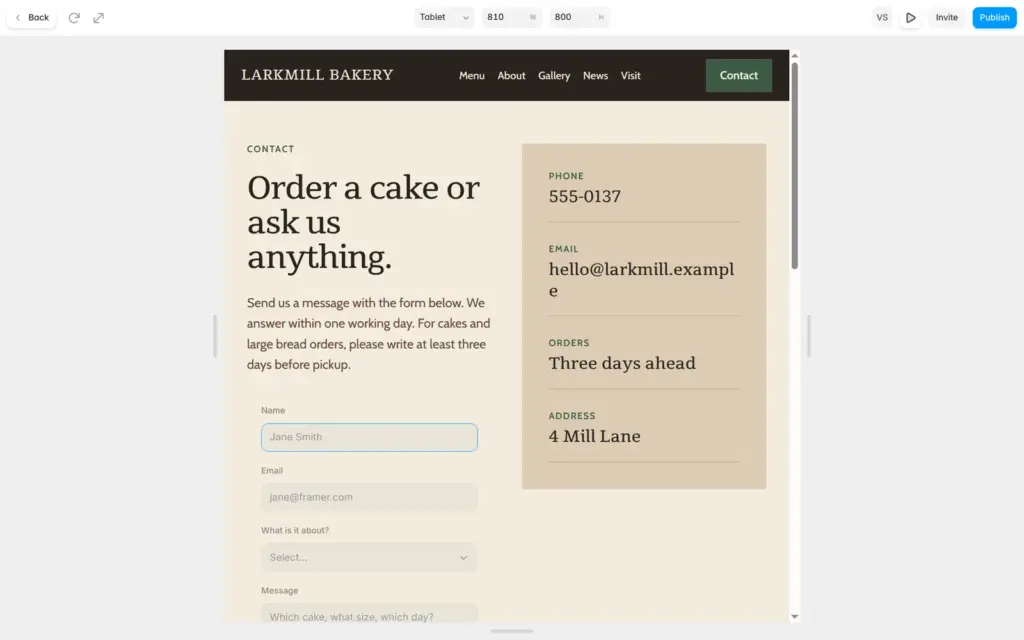
The preview button opens the page in a browser view where you can switch between desktop, tablet and phone widths.
The separate phone version works well once you know about it. It also means that a change on the desktop version does not always reach the phone. Two of the problems further down came from that.
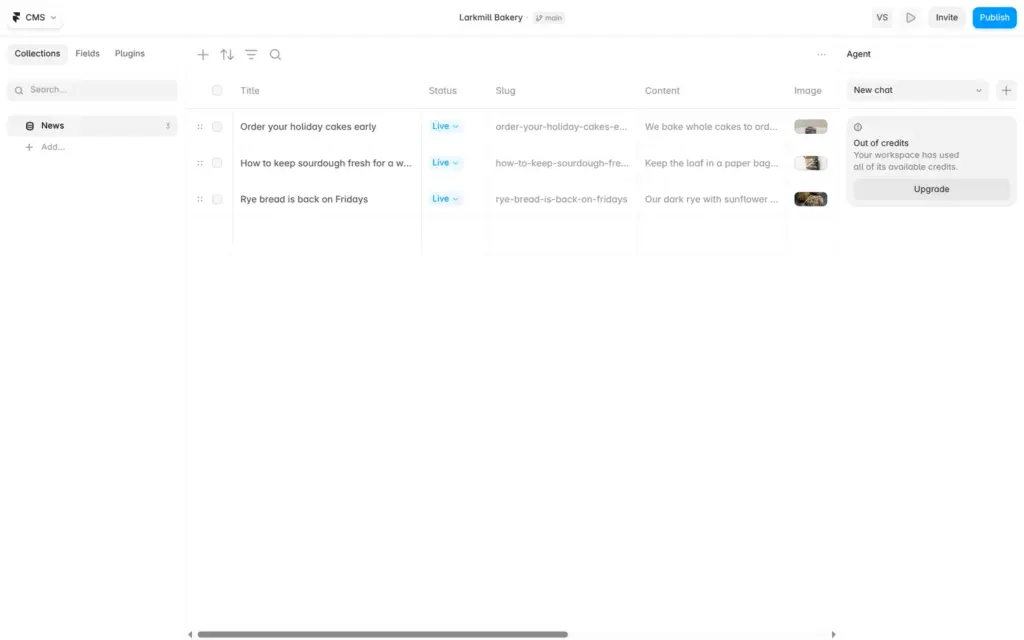
Framer's CMS is where you keep repeating content like news posts, staff profiles or products. You create a collection, add fields and fill in one row per post.
My News collection started with a title, a web address (Framer calls it a slug), a status and a text field. I added a photo field and a date. Framer also has fields for galleries, links, files, colors, numbers, options and references to other collections.
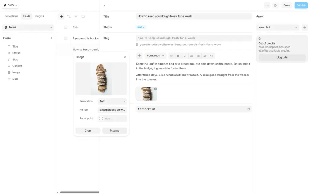
Each post opens in a form with its fields. The slug fills in from the title. The text field has buttons for headings, lists, links and quotes, and the photo field uses the same Unsplash plugin. I added a short description to each photo for screen readers.
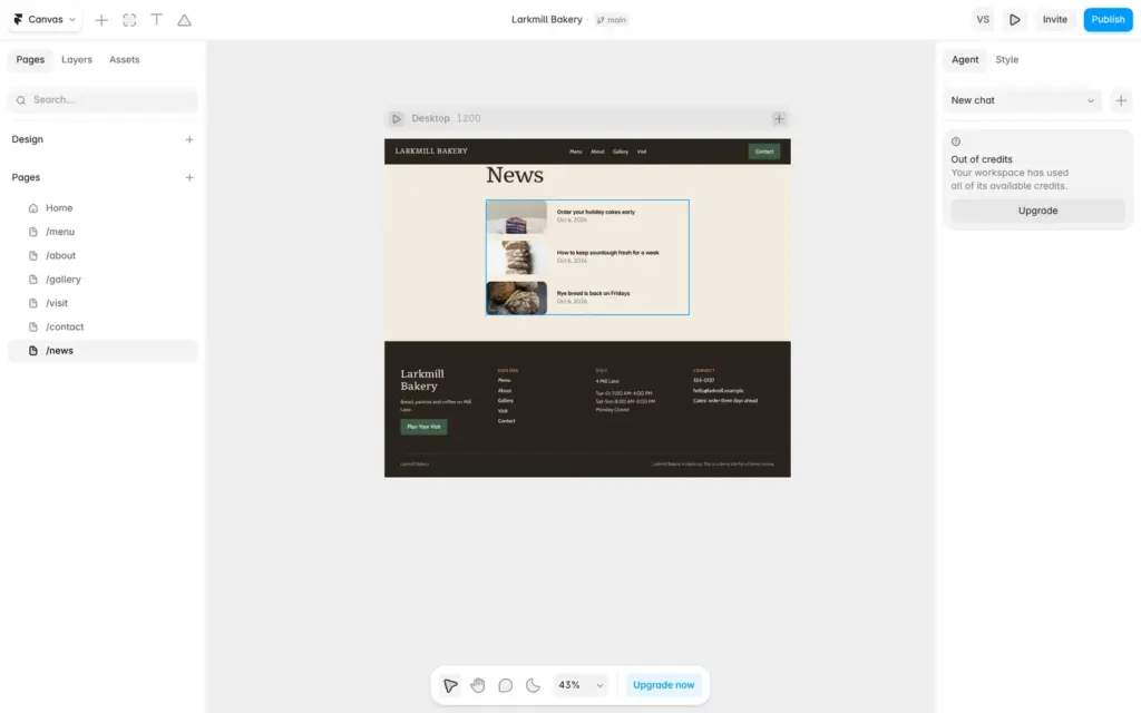
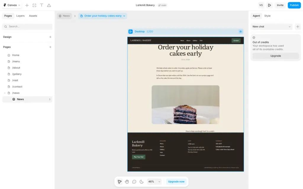
"New CMS page" then built two pages, a news list and a page for a single post. Both use the site's header, footer, fonts and colors. The post page shows the title, date, text, photo and a link to the next post.
The template's contact page had a phone number and an email address, but no form. Framer has a form block in its Insert panel. It comes with a name field, an email field and a sample dropdown with city names.
I dragged it under the text and made it as wide as the text. For the message, I copied the email field and switched the copy to a larger text box. Fields can be text, text box, email, number, phone, web address, date or time. I renamed the dropdown to "What is it about?" with the options cake order, bread order and something else.
Messages can go to an email address, to a webhook for other software, or to a Google Sheet. I chose email, and Framer filled in the email address of the Framer account. I changed the sender name and the subject.
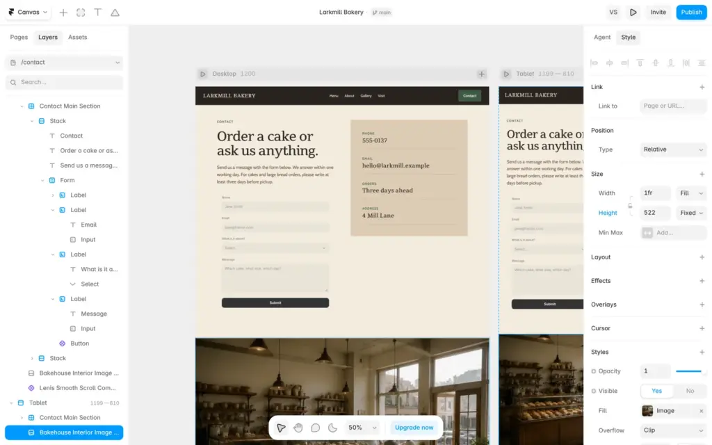
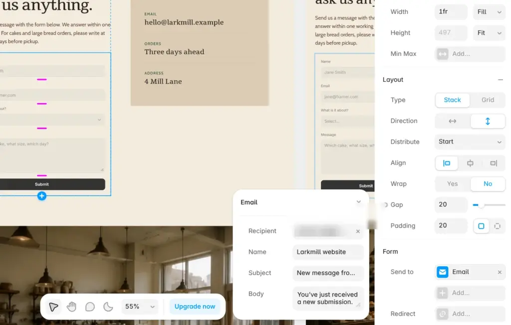
The sample form only made the dropdown required. After the first test I made name, email and message required too. Framer also adds hidden spam trap fields to the form.
A free site first gets a random address like secured-cantaloupe-914581.framer.app. Under Domains I picked larkmill-bakery.framer.website for free. A custom domain such as larkmillbakery.com needs a paid plan.
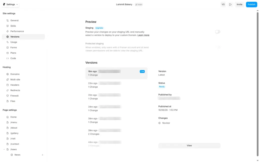
Changes go live only when you click Publish and then Update. Framer keeps each published version in a list, and you can open older ones. Staging, where you check a version on a separate address first, is a Pro feature.
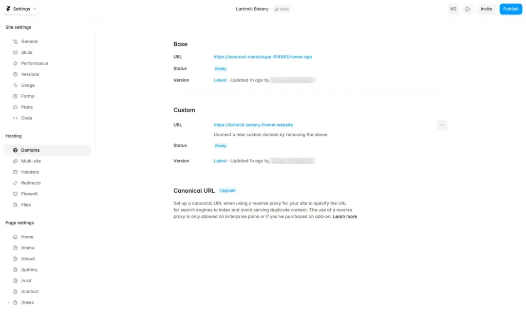
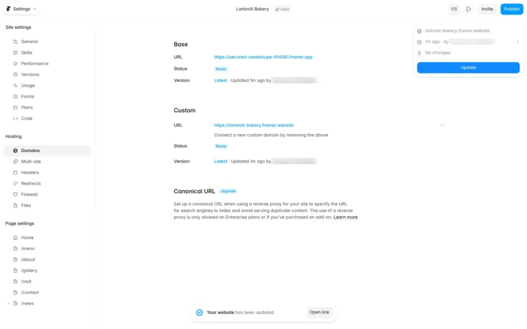
Free sites carry a "Made in Framer" badge in the bottom right corner of each page. On a phone it covers part of the content.
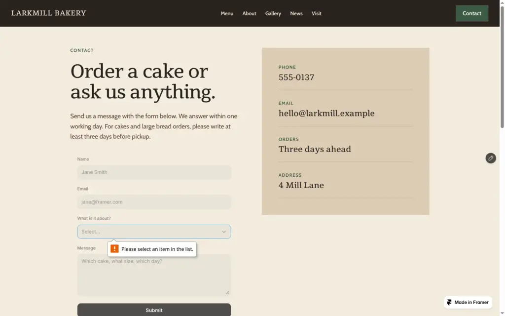
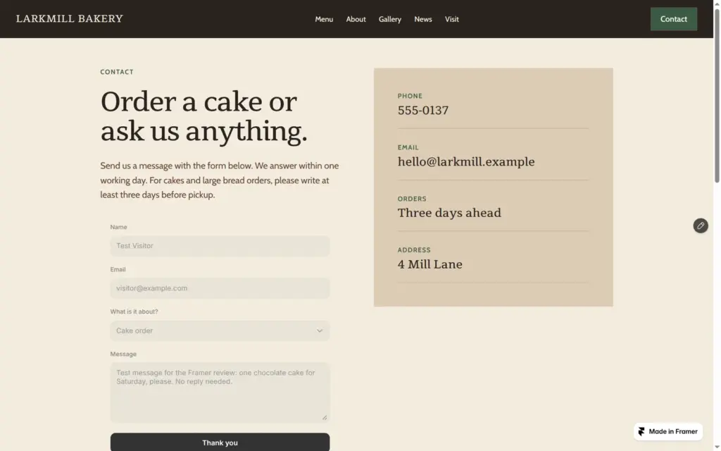
On the published site, the pages, the menu and the news section worked on desktop and on a phone. When I sent the form empty, the browser stopped it at the dropdown, which was the only required field at that point. A complete test message showed "Thank you" on the button.
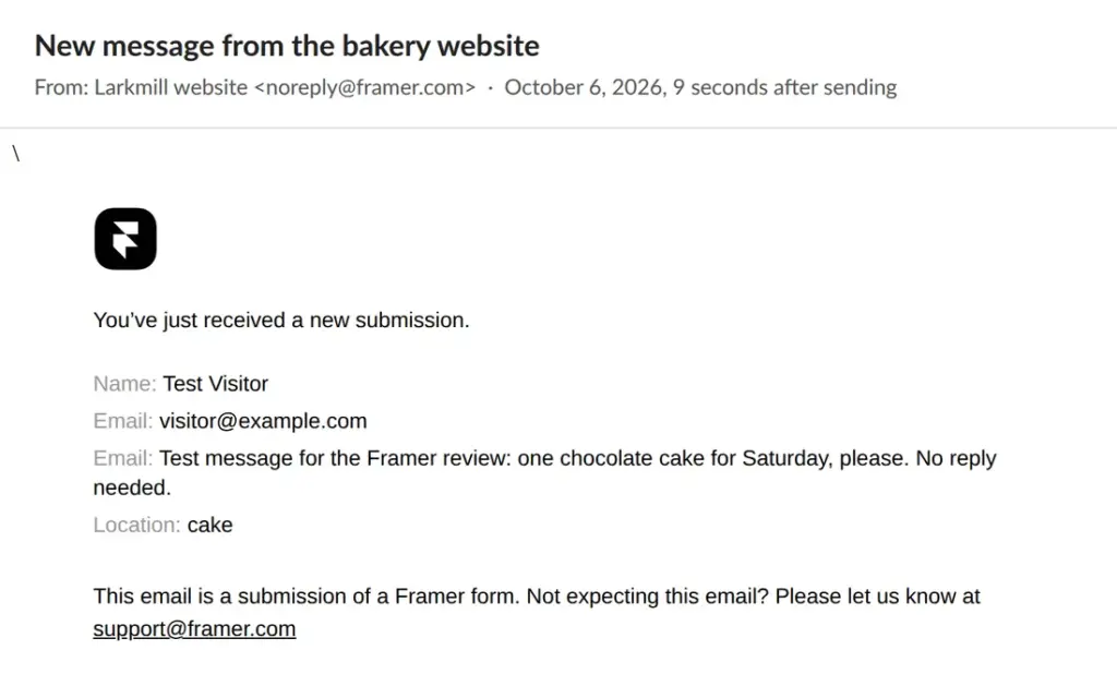
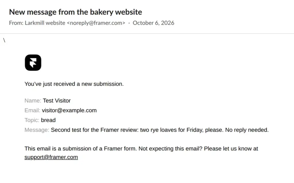
The first test email arrived 9 seconds after sending. It came from "Larkmill website" with the address noreply@framer.com, and it had my subject line. The second one took 14 seconds.
The first email had a problem. Framer lists the hidden name of each field, not the label visitors see. My message box was a copy of the email field, so its hidden name was still Email, and the message appeared under a second "Email". The dropdown was still called Location from the sample form. It sent the option's internal value (cake) instead of its title (Cake order). After I renamed the fields to Message and Topic, the email made sense.
Changing the visible text of the template was the easy part. These leftovers took longer, because the editor does not show them unless you look for them.
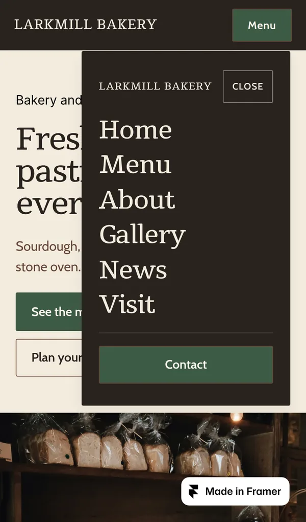
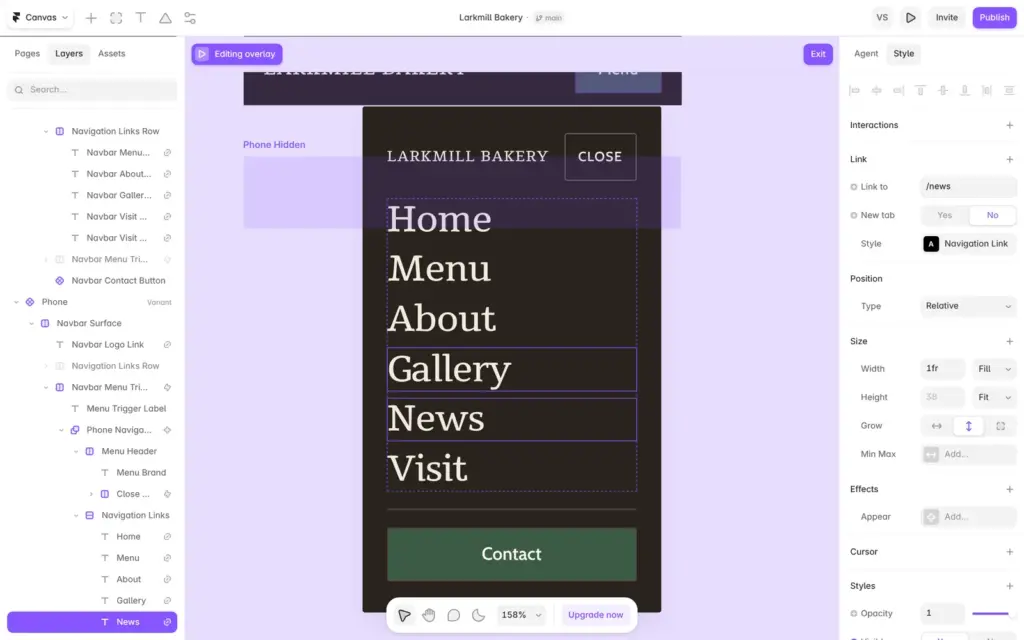
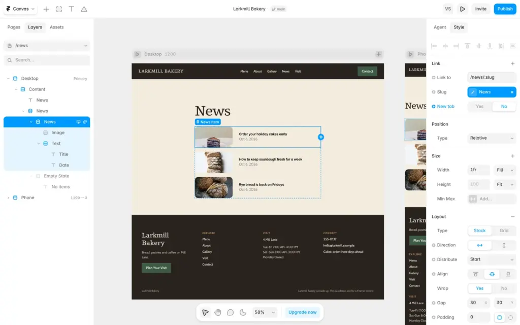
None of this is hard to fix. The risk is that you do not notice it. If you build from a template, click each link on the published site, open the phone menu and send yourself a test message before you share the address.
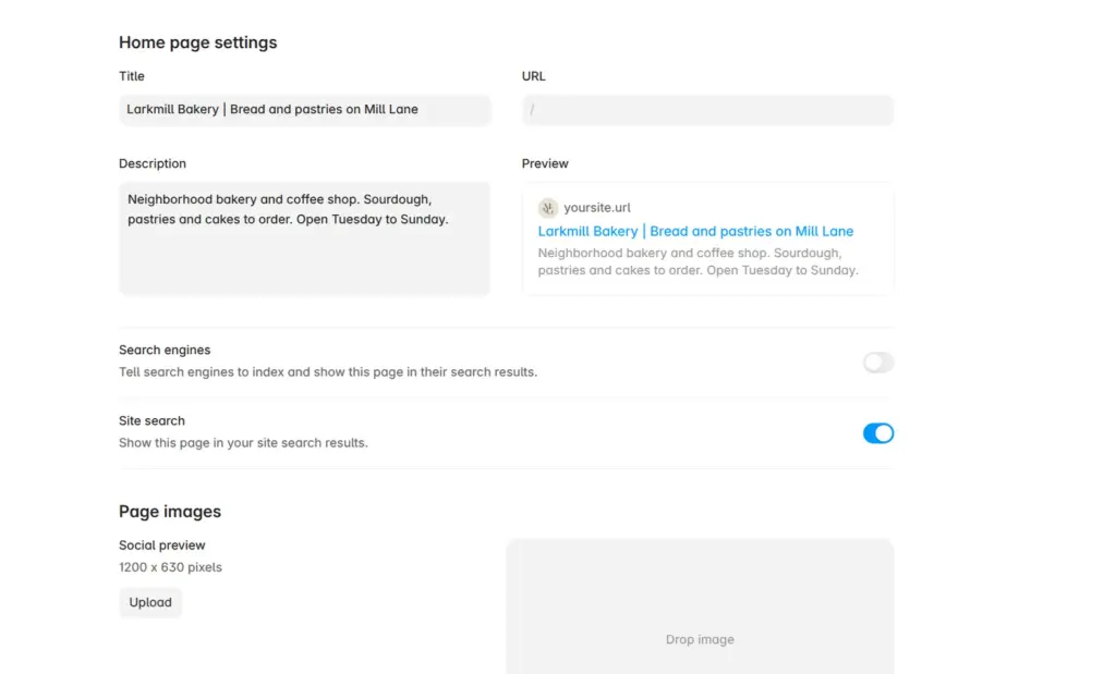
Each page has its own search title, description and social preview image in the site settings. A preview shows how the page might look on Google. The search titles still said Morrow & Grain.
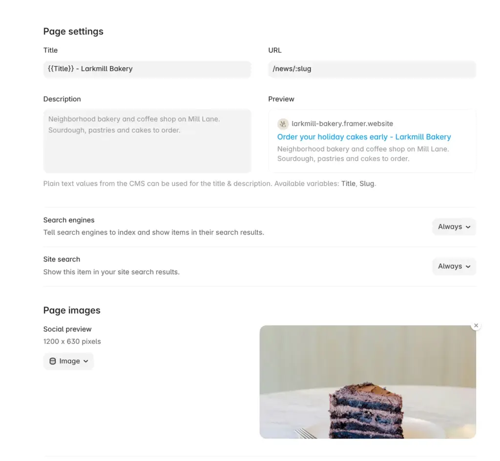
A switch tells search engines whether to list a page. I turned it off for all pages, because the bakery is made up. CMS pages get a title pattern like {{Title}} - Larkmill Bakery, which gives each post its own title.
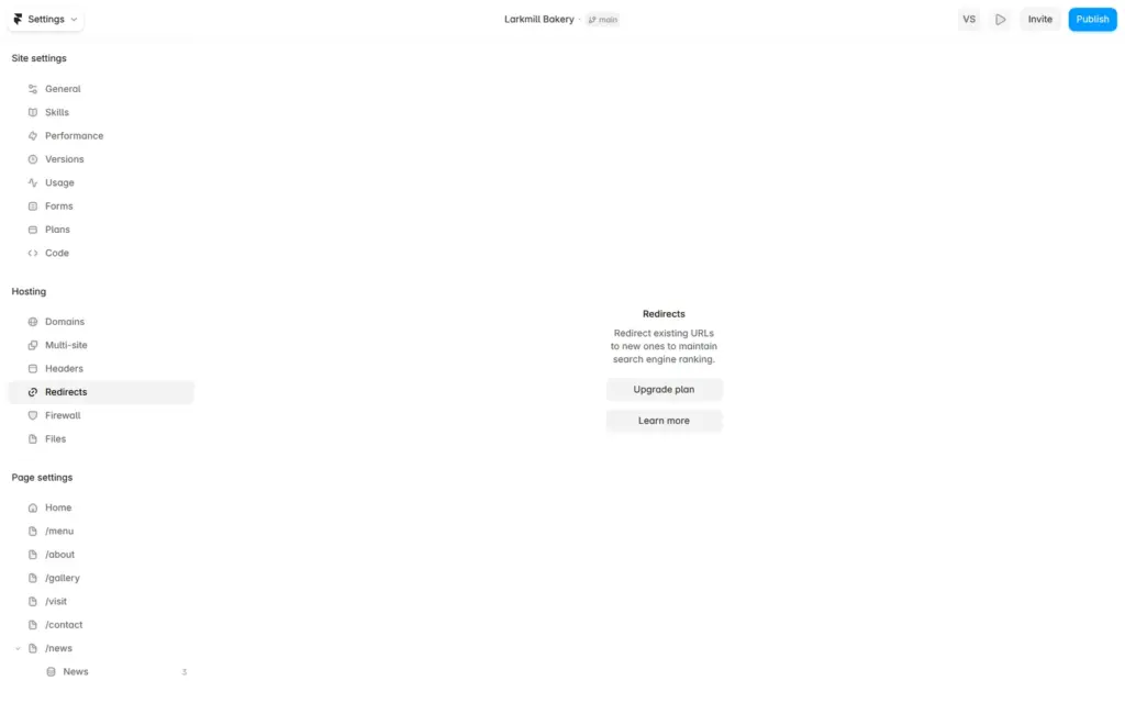
Framer creates a robots.txt file and a sitemap. Pages that I hid from search engines were left out of the sitemap. The pages had no language tag until I chose English as the site language in the general settings. Redirects, which keep old addresses working after a move, need the Pro plan.
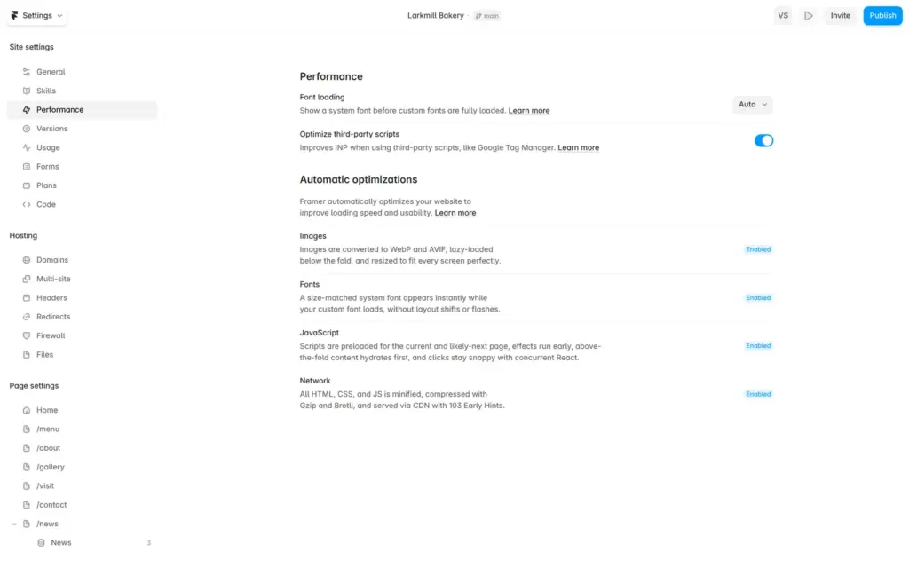
Framer optimizes sites on its own. Its settings say that it converts images to modern formats, resizes them and loads them only when needed, and that it handles scripts and fonts for speed.
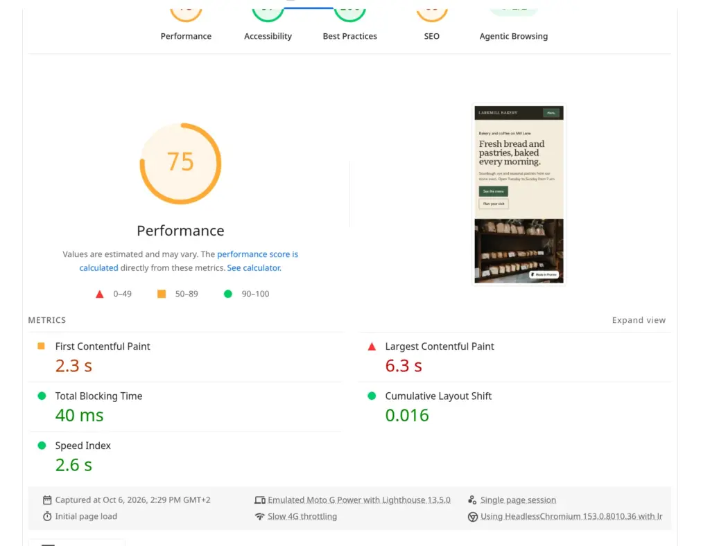
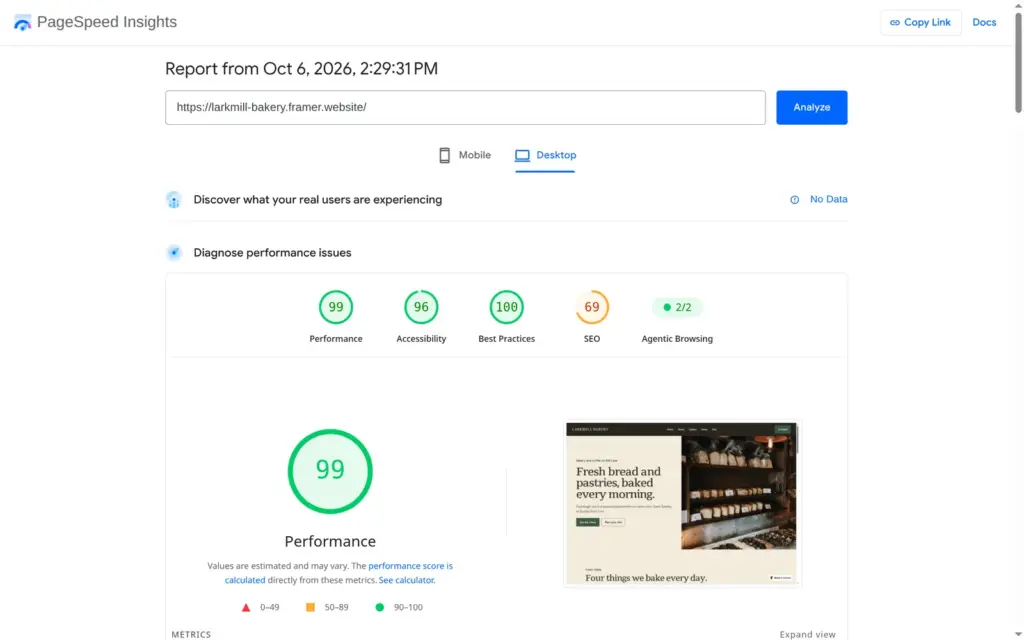
I ran the published home page through Google's PageSpeed Insights once. On a simulated phone it scored 75 out of 100, and the largest image took 6.3 seconds to appear. On desktop it scored 99, and the largest image appeared after 1.0 seconds. The report said the photos could be about 650 KB smaller. The biggest files were full-size stock photos that I had picked.
Accessibility scored 97 on the phone. The only problem it found was a missing main landmark, a tag that helps screen readers jump to the content. The search score of 69 comes from my choice to hide the pages from search engines.
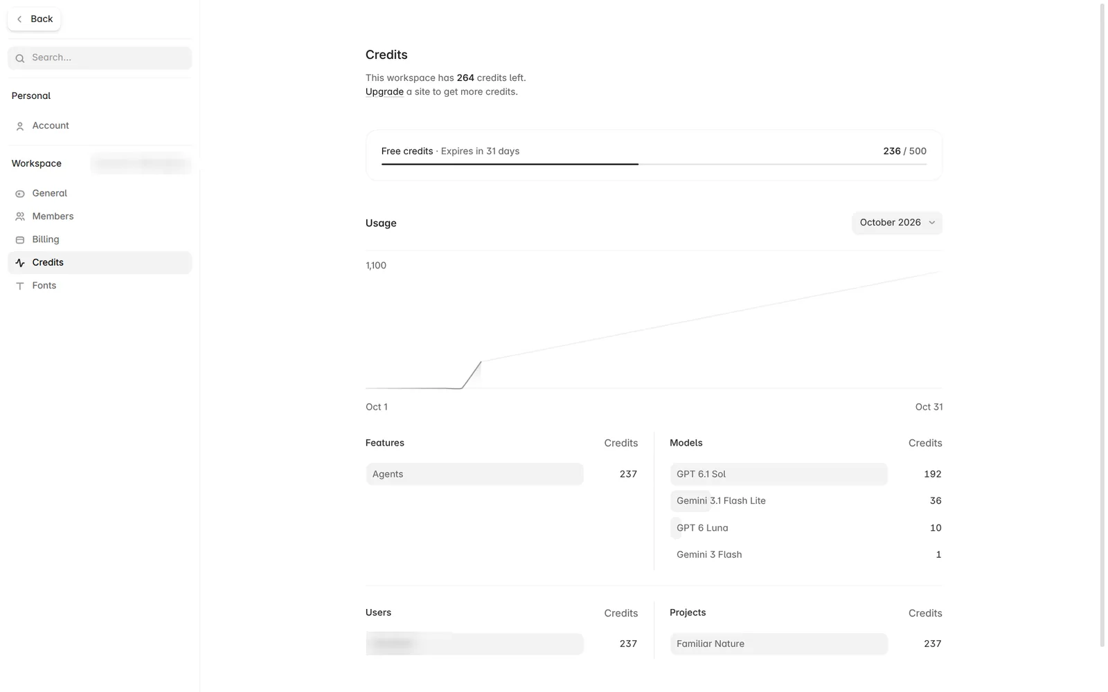
The AI agent sits in the right panel of the editor. You describe what you want, and it builds or changes pages. Free accounts get 500 credits to try it. The credits page said they expire in 31 days.
I started a new site and gave the agent this description:
Build a website for Brookfern Physio, a small physiotherapy practice with three therapists. Pages: home, treatments with prices, about the team, and contact with a form to request an appointment. Calm and friendly look that works well on phones.
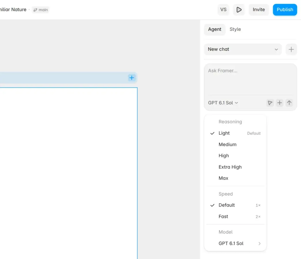
The agent used GPT 6.1 Sol. A menu next to the input offers other models, five reasoning levels and a Fast option.
Before it built anything, the agent wrote a short plan and asked three questions. It wanted to know which look I preferred, whether the menu, buttons and styles should be shared between pages, and what to do about missing names, prices and practice details. I picked the first answer each time. That meant sage green with natural photos, shared parts and clearly marked placeholders.
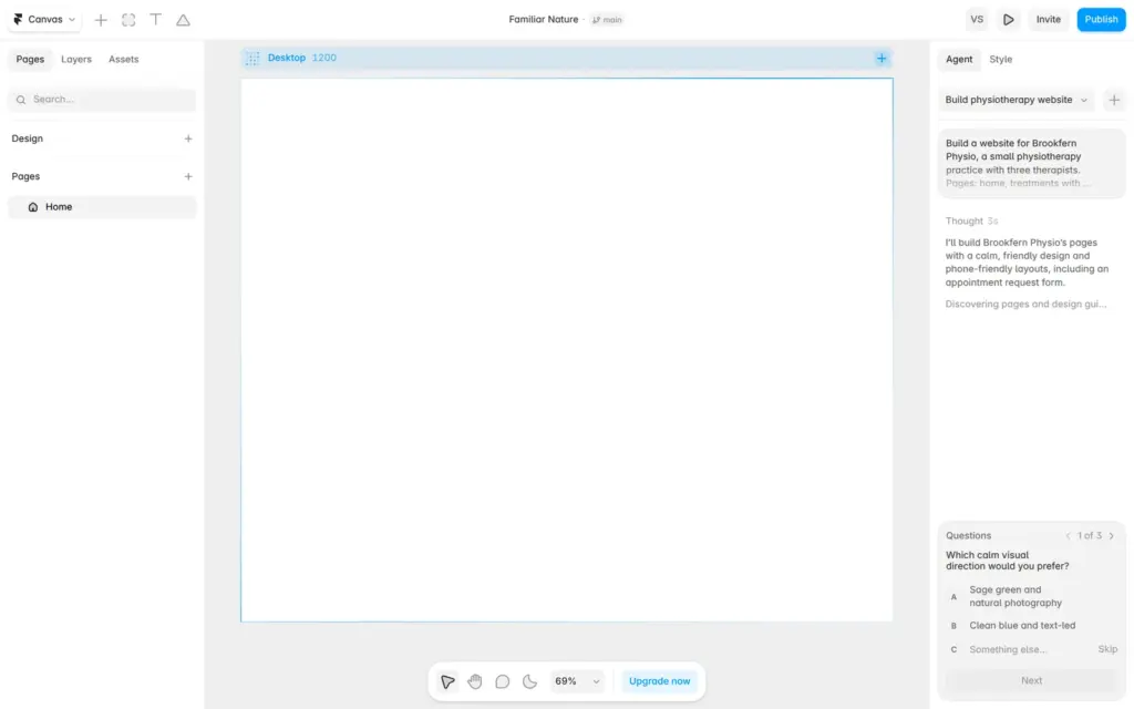
Building took about three and a half minutes. The site had four pages, each with desktop, tablet and phone versions. The header and footer were shared components, and the colors and fonts were saved as styles. The home page had one photo of a physiotherapist with a patient.
The treatments page listed four treatments with sample prices in British pounds, written in British spelling. I had not asked for either. Therapist names, the address, opening hours and the email address were placeholders, and the footer says "Practice details are placeholders". The contact form asks for name, email, phone, preferred times and a message. At the end, the agent asked which email address should receive the appointment requests.
The first version had one visible bug. On desktop, the menu links in the header sat on top of each other instead of in a row. I described the problem in two sentences, and the agent changed the shared header. Desktop and tablet now show the links in a row, and phones get a Menu button. The fix took about two minutes.
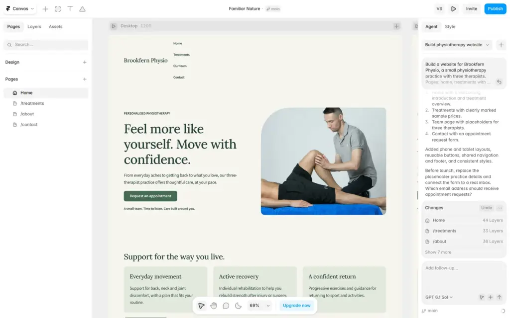
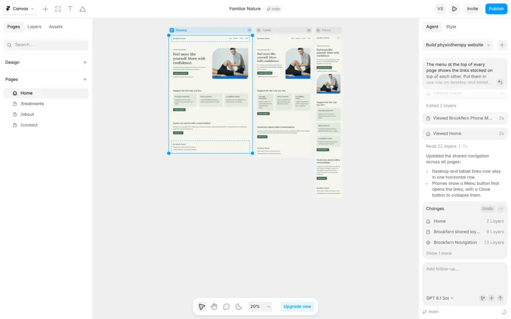
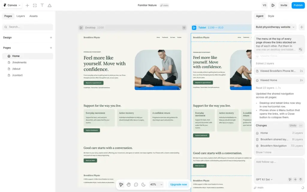
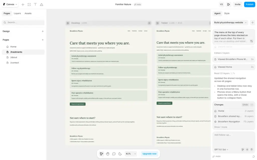
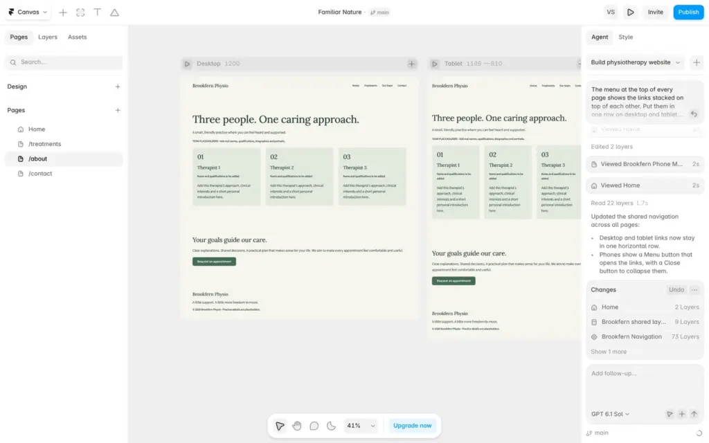
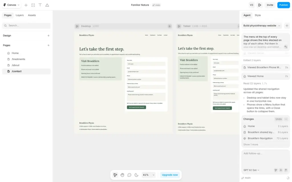
The result looks tidy and plain. As a first version for a small practice it works, and the placeholders make clear what is missing. The owner still has to add the names, team photos, prices, address and the inbox for the form.
The build used 135 credits and the fix used 101, so two requests used 236 of the 500 free credits. Most of the credits went to GPT 6.1 Sol, with smaller amounts for Gemini 3.1 Flash Lite, GPT 6 Luna and Gemini 3 Flash. Basic includes 1,000 credits a month and Pro 3,000. At this rate, Basic's monthly credits cover about four sites of this size with one fix each.
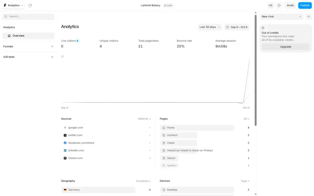
Framer counts visitors itself. According to its help center, these statistics use no cookies and need no cookie banner. The free plan shows visitors, page views, sources, pages, countries and devices. Basic keeps 30 days of history and Pro 90 days.
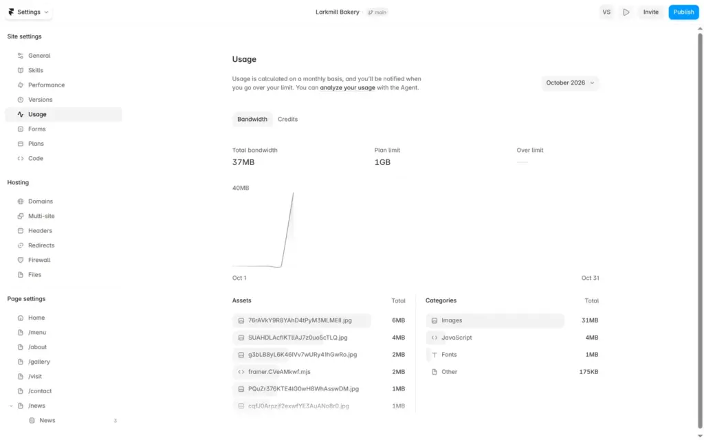
The free plan includes 1 GB of data transfer a month. My test day used 37 MB.
The settings also have a place for your own scripts, for example a booking widget or another statistics tool. I did not test it.
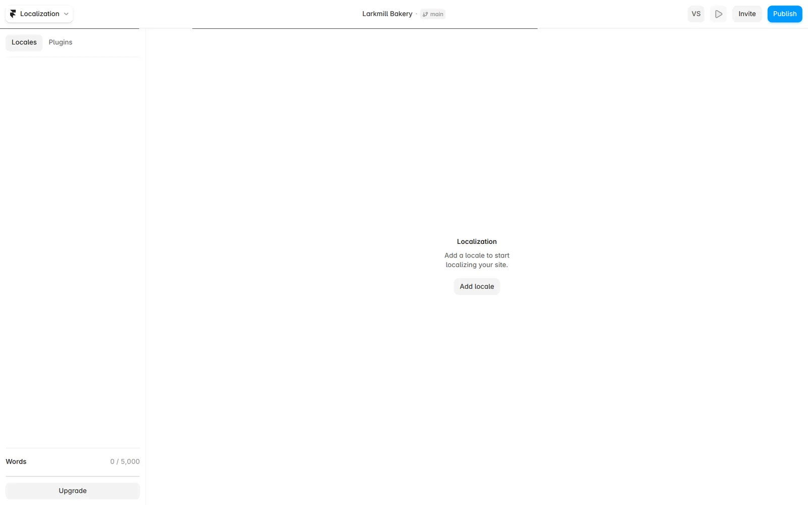
The localization panel shows 5,000 free words on the free plan. Each extra language costs $20 or €20 a month on yearly billing. I did not translate the site.
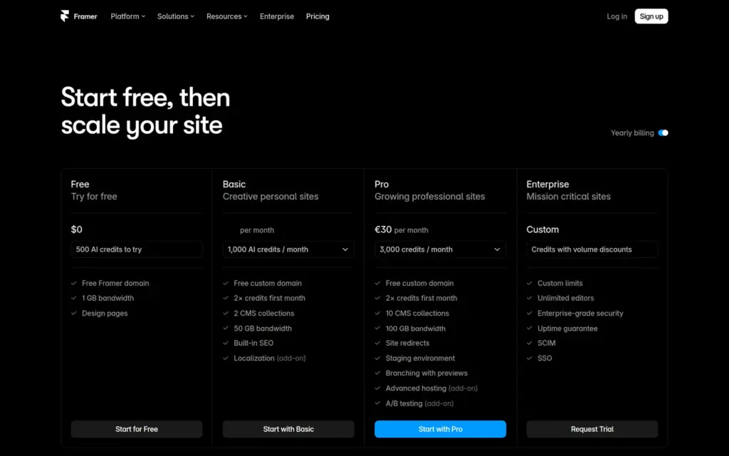
I checked Framer's pricing page on October 6, 2026. Framer lists its prices in US dollars. From Germany, the page showed the same numbers in euros. Framer says it adjusts prices by region, so other countries can see other amounts. Sales tax or VAT comes on top at checkout.
| Free | Basic | Pro | |
|---|---|---|---|
| Billed yearly | $0 | $10 / €10a month, $120 / €120 a year | $30 / €30a month, $360 / €360 a year |
| Billed monthly | $0 | $15 / €15a month | $45 / €45a month |
| Web address | name.framer.website | Your own domain, free for the first year on yearly billing | Your own domain, free for the first year on yearly billing |
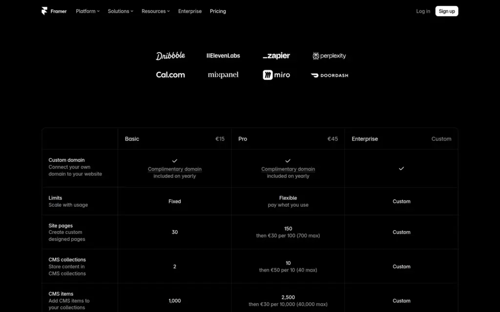
| Pages | 1,000 | 30 | 150 |
| CMS collections | 10 | 2 | 10 |
| CMS items | Not listed | 1,000 | 2,500 |
| Data transfer a month | 1 GB | 50 GB | 100 GB |
| AI credits | 500 to try | 1,000 a month | 3,000 a month |
| Visitor statistics history | Not listed | 30 days | 90 days |
| Redirects and staging | No | No | Yes |
Extra editors, languages and higher limits are paid on top.
| Billed yearly | Billed monthly | Notes | |
|---|---|---|---|
| Additional editor | $20 / €20 | $30 / €30 | Per person and month. Can change the design and publish. |
| Content editor | $10 / €10 | $15 / €15 | Per person and month. Can change CMS posts and text. |
| Viewer | Free | Free | Can view and comment. |
| Extra language | $20 / €20 | $25 / €25 | Per language and month. |
| 100 more pages | $20 / €20 | $30 / €30 | Pro only, up to 700 pages. |
| 10 more CMS collections | $40 / €40 | $50 / €50 | Pro only, up to 40 collections. |
| 10,000 more CMS items | $20 / €20 | $30 / €30 | Pro only, up to 40,000 items. |
| 100 GB more data transfer | $40 / €40 | $50 / €50 | Pro only, up to 2 TB. |
For the bakery, Basic on yearly billing costs $120 or €120 a year. The free domain covers the first year only. If a shop assistant should post the weekly bread news with their own login, a content editor adds $120 or €120 a year.
One limit is easy to miss. Basic allows only 2 CMS collections, while the free plan allows 10. A site with news, menu items and job openings in separate collections would need Pro.
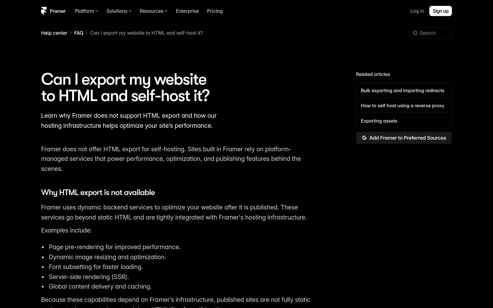
Framer hosts your site, so you do not need a separate web host. The other side is that you cannot download the site and host it somewhere else. Framer's help center says that it does not offer HTML export. If you move to another builder later, you take your text and photos with you and rebuild the pages.
Framer fits a small business that wants a well-designed site with a few pages, some news and a contact form, and an owner who enjoys working on the design. For the bakery, a free template gave me a site that looks professional on desktop and on phones. The AI agent gets you a tidy first version from a short description, and you fill in the details yourself.
It fits less well if you want to sell online. I found no shop features in the editor or on the pricing page, so selling would need an outside service like Shopify. It also fits less well if you publish a lot, because Basic's 2 collections and 1,000 items fill up fast. And it fits less well if you want an editor that hides layers, screen sizes and components from you.
If you try it, build the whole site on the free plan and test it on your phone before you pay. Most of what I found wrong only showed up on the published site.
 What I'm building
Give Vroni a GitHub issue, bug report, spec, or rough idea. It reads the repo, plans the change, writes code, runs checks, and works toward a review-ready pull request.
Take a look at vroni.com